The “Irby brand” is the collection of notions, ideas, and perceptions related to the organization. A brand identity is much more than a logo. However, consistent use of a logo mark and release of consistently-formatted professional communications impact the perceptions that define the company brand.
Please follow these guidelines with careful attention to requirements. These guidelines will help create a consistent brand identity for Irby Construction Company and reinforce the desired market perception. Failure to follow these guidelines can negatively impact the image of the organization.
VISUAL & BRAND IDENTITY
The Full Logotype
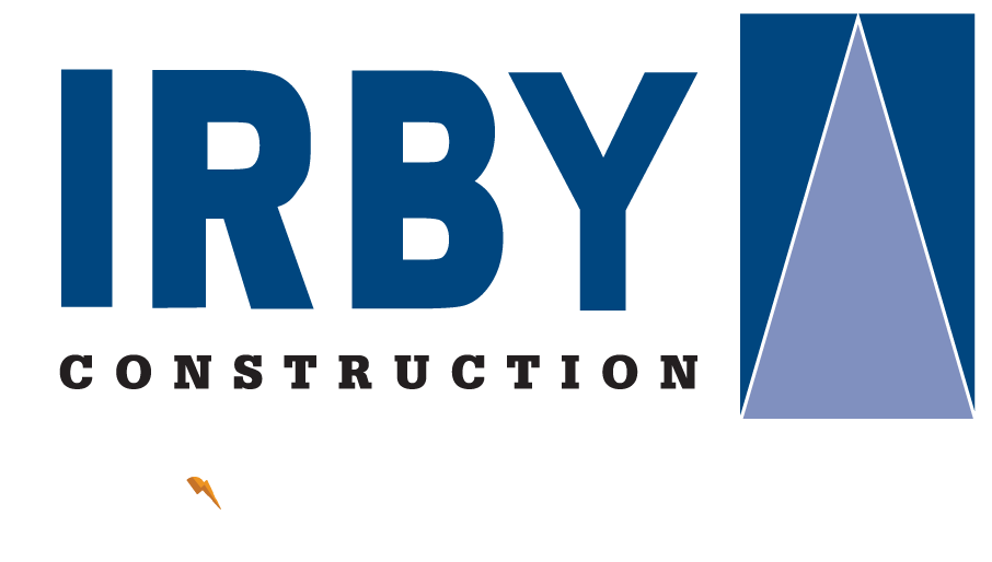
The IRBY Construction company logo comprises two elements, the logo symbol and logo type. The logo references electric power infrastructure and is a symbol of the company structure and culture. The logo type has been carefully chosen for its modern and yet refined, highly legible style, which has been further enhanced by the use of upper case letters. Consistent use of the logo ensures the consistency of the brand.
Download the full guide to the right or view the online standard here.
Brand Identity Guidelines PDF
Download
IRBY LOGO
Our logo is the fundamental building block of our identity; the primary visual element that identifies us. The relationship between the logo and the icon have a fixed relationship that should never be changed or altered in any way.

Primary Logo
Download .png
Download .jpg

Secondary Logo
Download .png
LOGO CLEARSPACE
It is important to keep company marks clear of any other graphic elements. To regulate this, an exclusion zone has been established around the company mark. This exclusion zone indicates the closest any other graphic element or message can be positioned in relation to the mark. This rule is heavily enforced in small applications or spaces where the logo is confined to constricted spaces.
Whenever you use the logo, it should be surrounded with clearspace to ensure its visibility and impact. No graphic elements of any kind should invade this zone.
Computation
To determine the clearspace take the height of the logo not including the tagline, and divide it in half. (Clearspace = Height / 2).
NOTE: The clearspace is also enforced when the small logo (with no tagline) is being used. The clearspace in small format becomes the height of the logo.
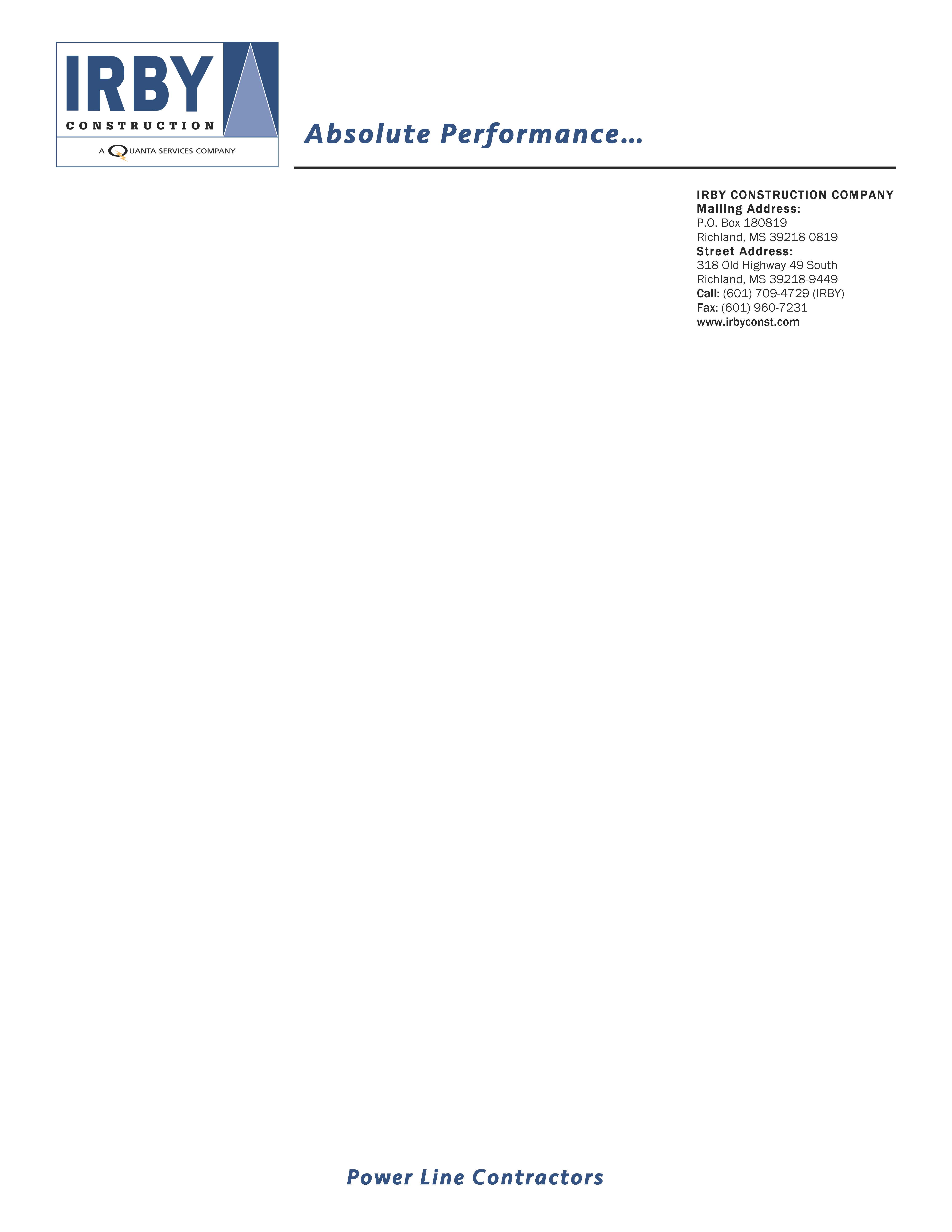
STATIONERY
LETTERHEAD
This shows the approved layouts with the primary elements of the IRBY Construction stationery system for the front of the letterheads. The letterhead will be used for all official communication that is going out of IRBY Construction.
To install this template on your computer, download the .dotx file below and place it in the “My Templates” folder in the Microsoft Office application.
COLORS
Primary Color Palettes
Charcoal Grey
C: 20
M: 0
Y: 0
K: 100
R: 72
G: 81
B: 85
#485155
Navy Blue
C: 100
M: 78
Y: 33
K: 22
R: 24
G: 60
B: 107
#183C6B
Bright Orange
C: 0
M: 77
Y: 100
K: 0
R: 233
G: 86
B: 12
#E9560C
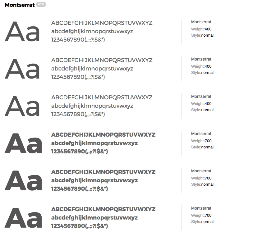
TYPOGRAPHY
The Corporate Typography
Typography plays a vital role in communicating an overall tone and quality. Careful use of typography reinforces the company personality and ensures clarity and harmony in all IRBY Construction communications. We have carefully selected two typeface families, Avenir Next Family and Montserrat.
Desktop / Print Fonts
Avenir Next is a font family built with legibility in mind. The typeface is suitable for large display text and as well as small body text. The main weights to be used within the IRBY Construction brand are to the right. Other weights within the Avenir Next typeface are available to use, however, use minimally and with caution.
Montserrat is a strong typeface, perfectly suited for large display text or headlines. The boldness of this family compliments the airy nature of Avenire Next. This type can be used for headlines or subtext only. It should never be used for large body paragraphs or photo captions.